ux/ui design | website
SLCE
A non-profit platform to support children's education
SLCE (Sur Le Chemin de l'Ecole) is a French non-profit committed to helping vulnerable children from all around the world access education by connecting them with sponsors who can pay for their education fees.
Role
UX/UI Designer
Duration
2 months
Methods
Design Thinking
Agility
The project in a few words
The client needed some help to redesign their internal website : this platform helps manage children's profiles, their sponsors and the contracts binding them. I truly cared about the goals of this project because children’s education is a cause that I hold close to my heart, which helped me bring emotions to my design.
The miracle team
I joined a team of 6 working with agile methods, composed of : 1 Project Manager, 1 Product Owner, 2 front-end devs, 2 back-end devs. And a UX/UI Designer of course !
And my job ?
When I joined, the platform was only partially developed. My role was to redesign key user flows, create mockups that brought structure and visual clarity, and build a design system to support development…all while bringing some warmth and humanity through visual design.
Here is the result :
Rather than starting from scratch, I stepped into an ongoing project where I audited the existing platform. I used the already defined personas and client needs to focus on improving user flows, UI consistency, and creating a design system.
Understand
Learn about the project & understand the client's needs
Analyze the platform design & define pain points to address
After reading the documentation, understanding the client needs and auditing the platform, I identified a few key pain points which gave me directions as to what parts of the website needed my help.
Unclear calls-to-action & filters
Navigation elements such as calls-to-action and filters lacked clarity, making it difficult for users to know where to click or what they could do next.
Confusing user flows
Some key user flows did not take into account all possible scenarios, leaving users uncertain about how to complete a task from beginning to end.
Visual inconsistencies
Inconsistent use of colors, typography, spacing, and components between different pages created a fragmented and unpolished user experience.
Rigid and cold UI
While functional, I felt like the UI lacked the warmth and personality needed to reflect the human-centered values of the organization.
How did I solve those issues and bring solutions to the table ?
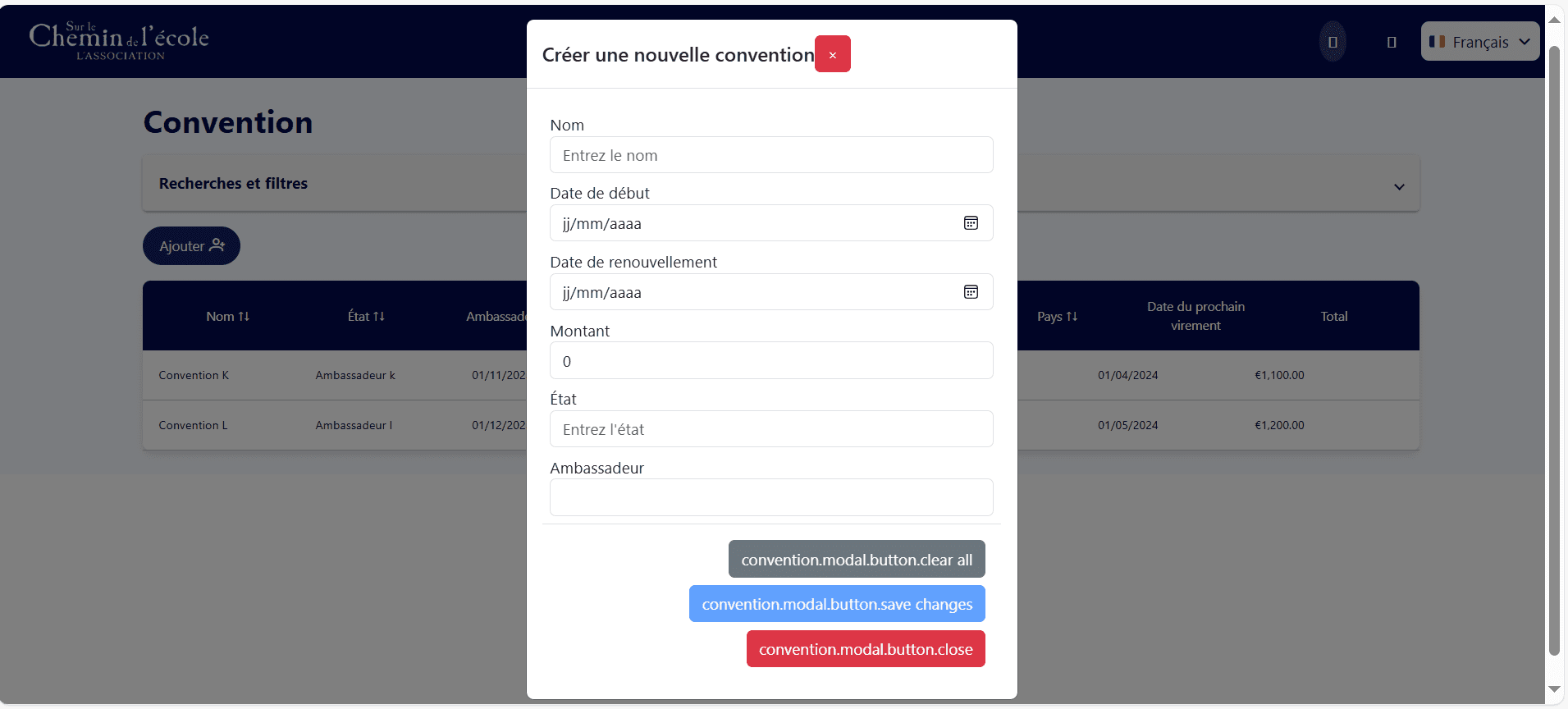
I began by addressing confusion in the platform’s navigation and calls to action in order to better guide users, by:
Restructuring the main navigation for better flow
Improving CTA visibility
Adding new possible actions for each element in the table
Before
After
Before
After
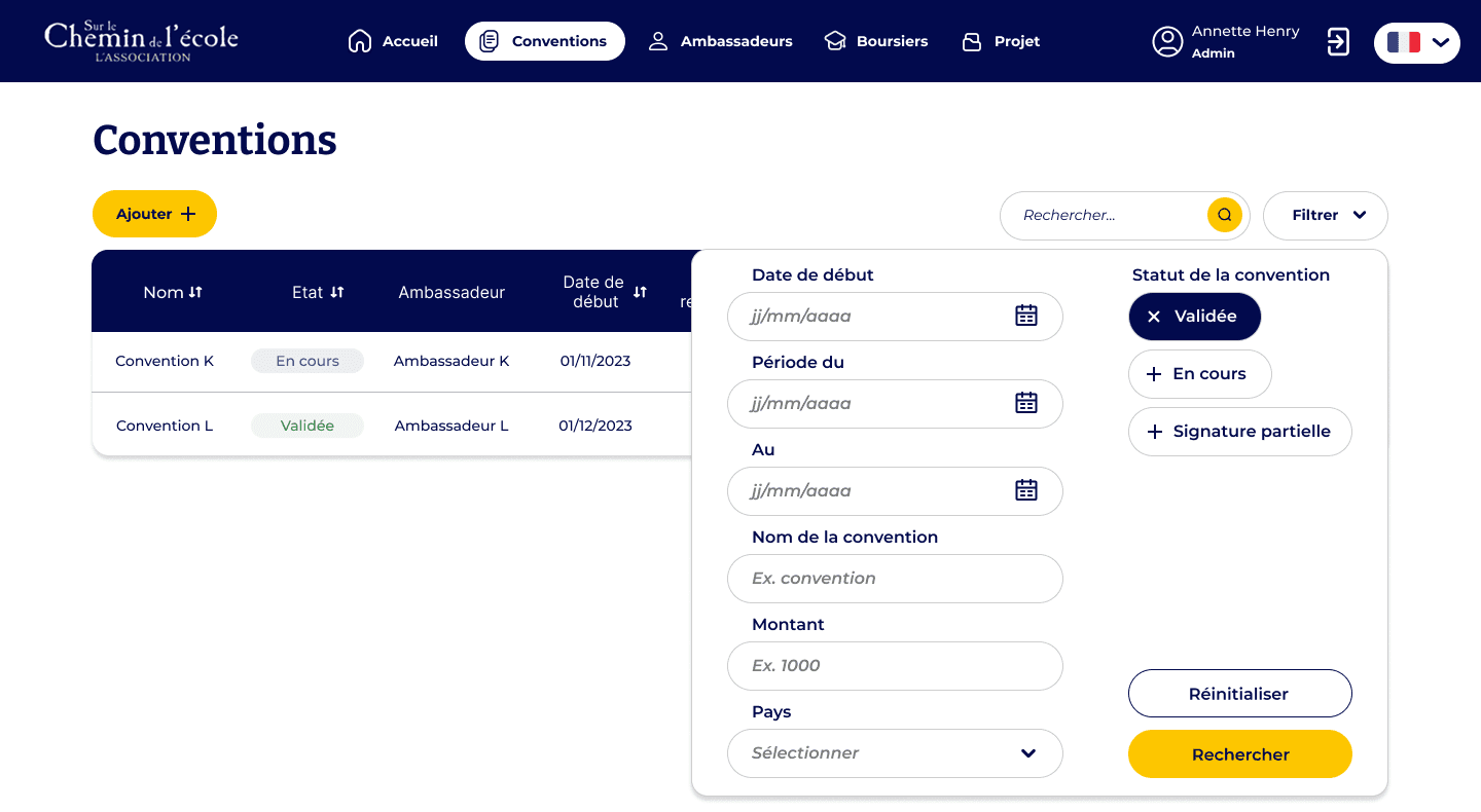
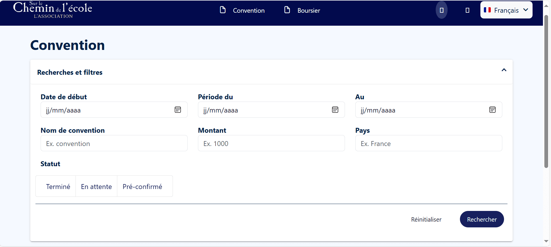
I then focused on redesigning the filters to make them more intuitive, visible, and aligned with real user needs, by:
Making the filter menu collapsible
Adding a search bar
Improving the filter selection system
Before
After
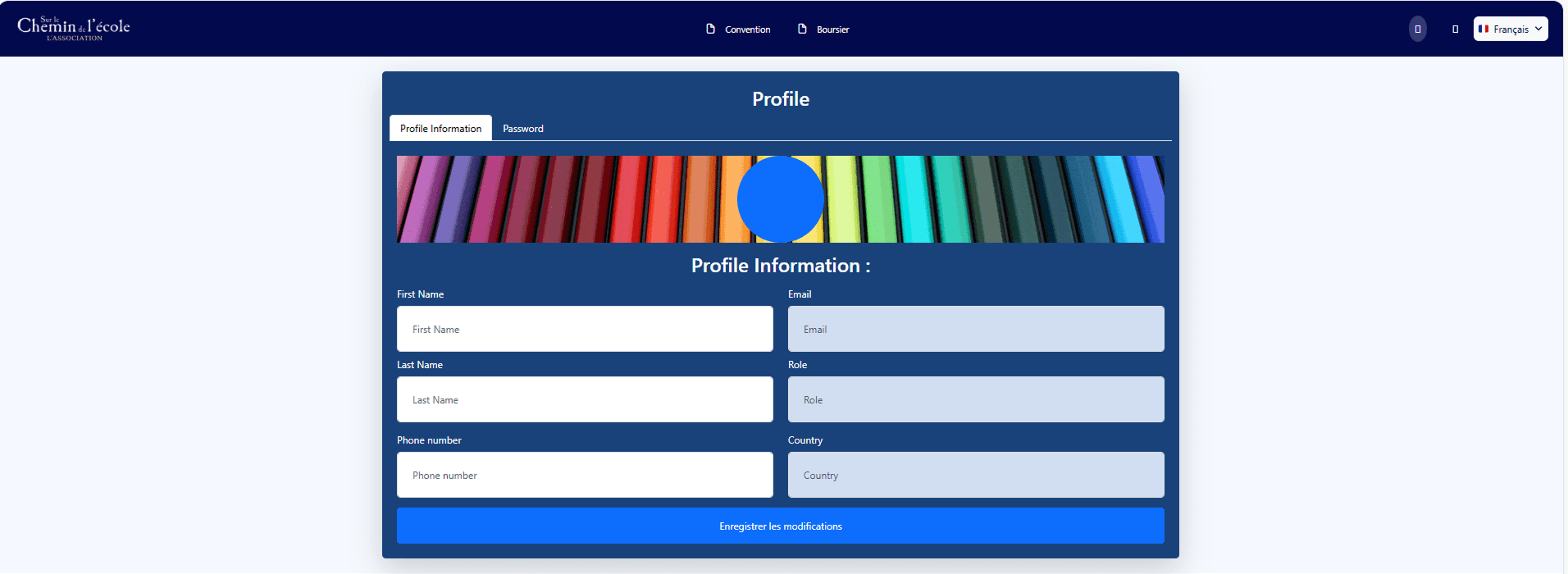
To make the platform more engaging and accessible, I developed a fresh color palette aligned with the NGO’s identity. I also introduced light illustrations to support key moments and add warmth, helping users feel more at ease while navigating the tool.
Who says that an admin platform cannot be cool and fun ?
I don't. I believe every project must be designed with users and therefore humans at heart, especially for an NGO supporting children's education.
From the start, the login page was cold and…well a bit old. I worked on modernizing the page to make it welcoming and pleasing.
Before
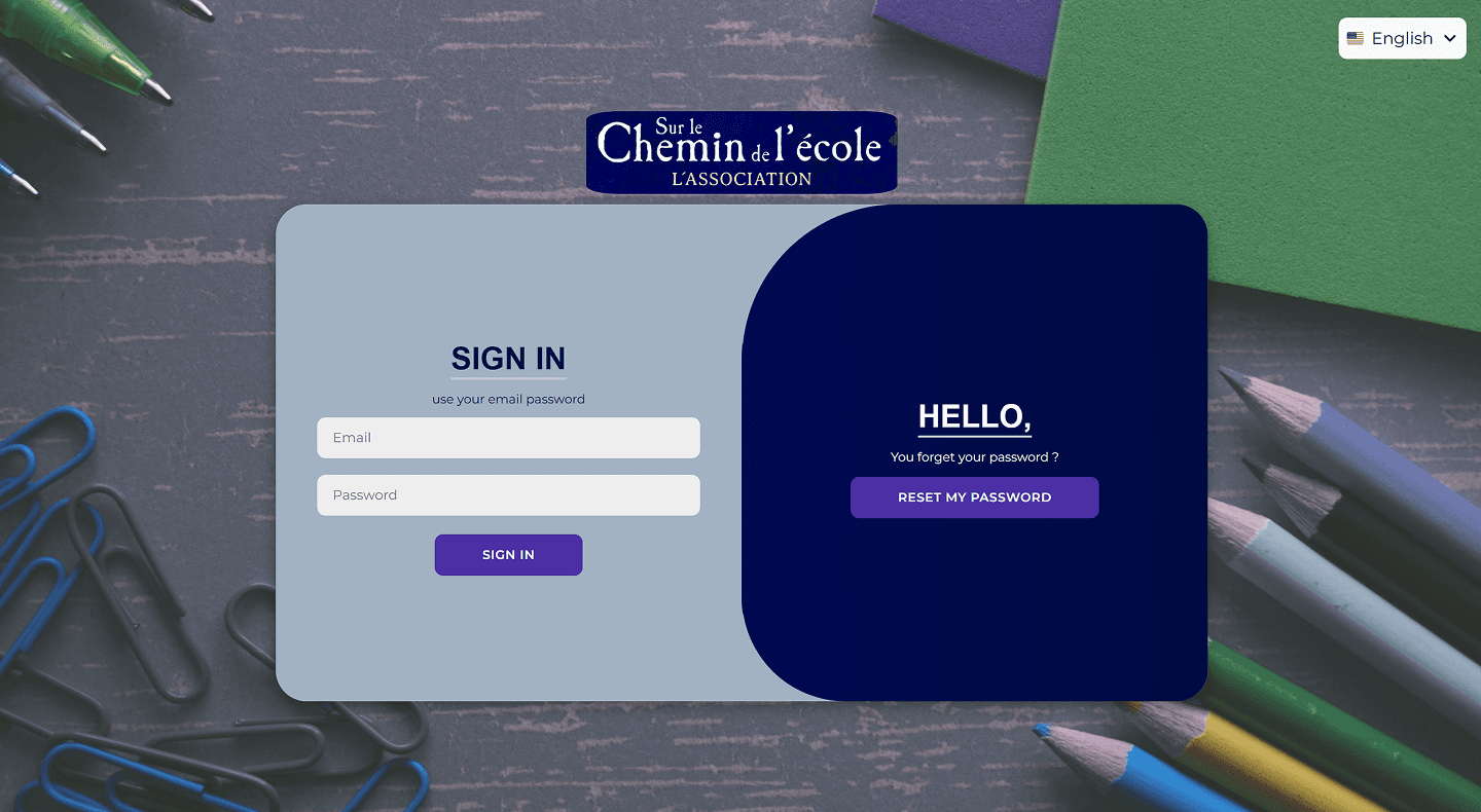
After
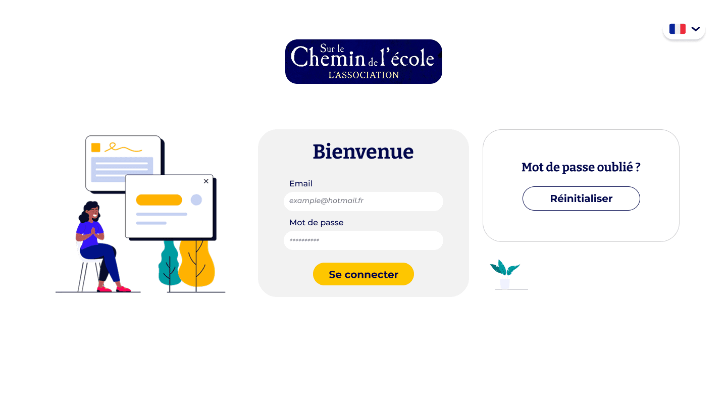
Before
After
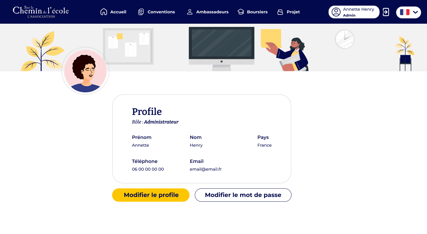
Throughout the design process, I carefully selected illustrations that aligned with the color palette previously defined with the client.
I used my graphic design skills to adapt and enhance illustrations found online, or created custom ones when needed.
This helped me design a platform that truly felt caring and human, and which I hoped would spark positive emotions.
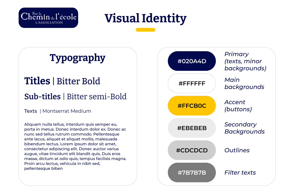
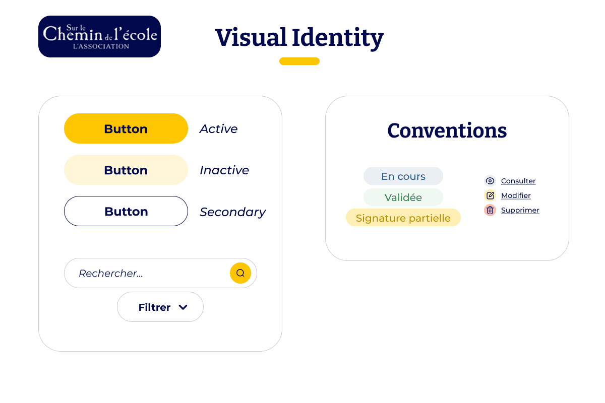
Finally I ensured that all of my work was understood and passed over to the development team by creating visual guidelines in Figma.
From Design to Code
To ensure a smooth transition from design to implementation, I prepared clear, structured documentation for the development team. This included annotated wireframes, UI specifications, and usage guidelines for components and color styles.
An Open Channel for Communication
I also maintained open communication with developers to answer questions quickly and help resolve edge cases. This collaborative approach helped preserve design intent and streamline the development process.
Working on this project taught me the importance of adapting to an existing ecosystem while still bringing fresh, thoughtful design solutions. Rather than starting from scratch, I had to quickly understand the context, build upon pre-existing materials, and identify what truly needed to evolve.
Beyond the visual layer, this project strengthened my ability to balance creativity with structure, especially through the creation of a reusable design system. Most of all, it reaffirmed that even admin tools can (and should) be user-centered, warm, and engaging—especially when supporting a mission that matters.
My Contribution In A Few Words
Restructured navigation and clarified user flows to make the platform more intuitive for internal users.
Redesigned the UI with a warm, human-centered visual identity, including a new color palette and soft illustrations aligned with the NGO’s values.
Created a set of Visual Guidelines to ensure consistency and streamline future development and iterations.
Final Results !
Let's see how all this work came together :


That's a wrap !
Thank you for reading this far 💛
