
La grenouille des tuileries
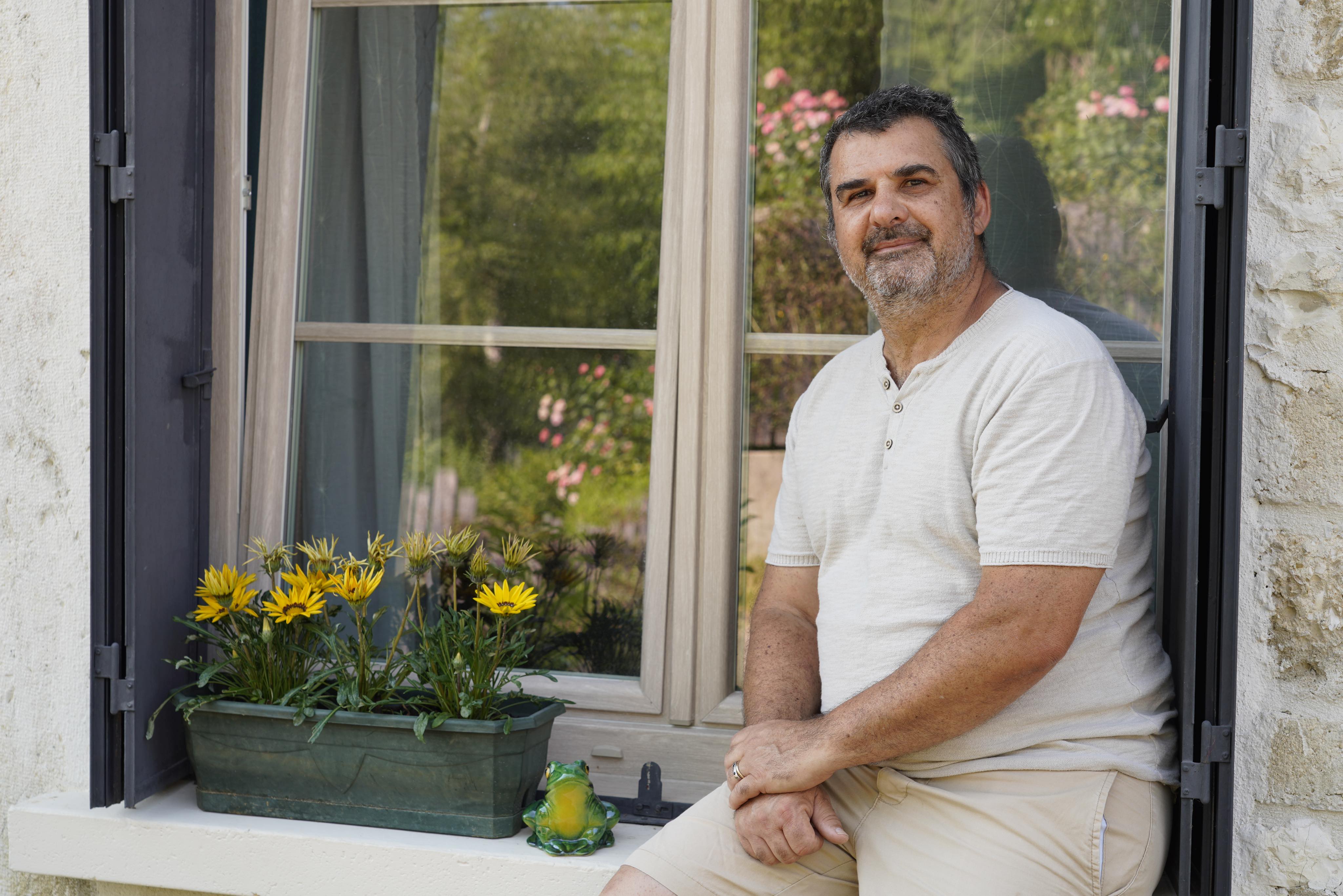
Philippe owns a charming house in the french countryside called ''La Grenouille des Tuileries'' (The Frog of the Tuileries), where he decided to welcome guests through the Airbnb platform.
But this is not a traditional Airbnb where you can come and go without seeing a soul !
This is a place where people can bring a bottle, find human connexion and discover his beautiful region.
The concept
The Airbnb that makes you feel at home !
Why was I needed ?
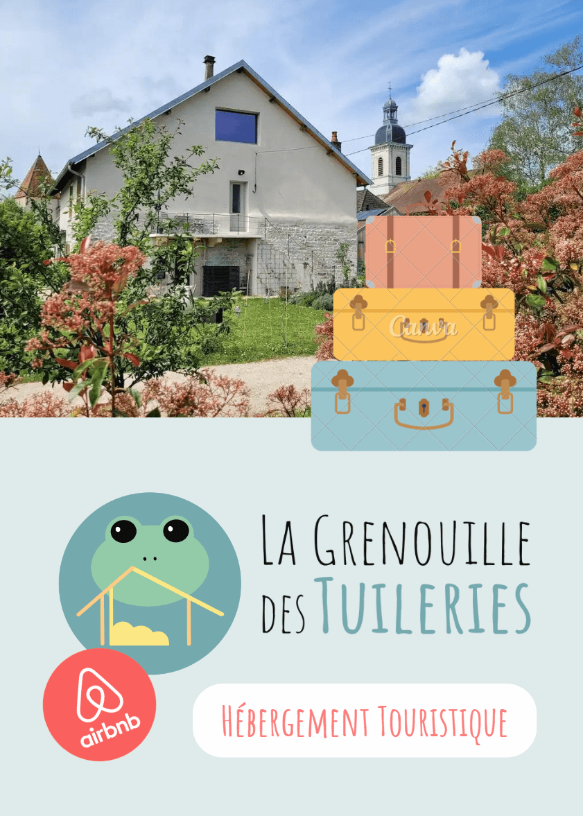
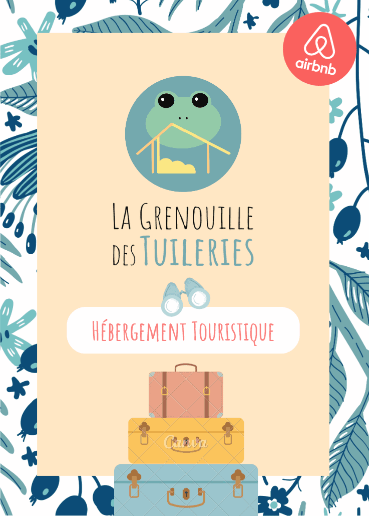
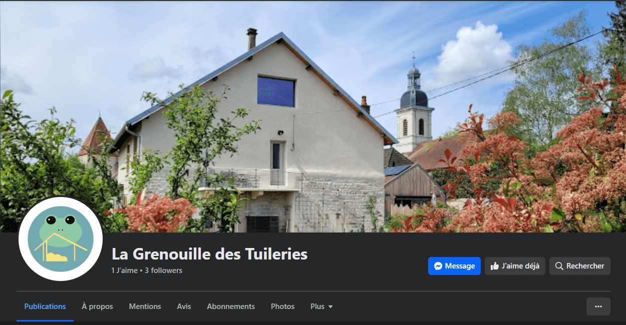
"La grenouille des tuileries" is a very local business, therefore its online presence needed some work. Creating a nice and comforting logo could help communicate the house's values and inspire trust in visitors (especially foreigners who might be looking for tips about the region).
This logo could also be printed on posters in order to give directions to clients when they arrive.
What was requested ?
Nothing at all ! Full creative freedom allowed on this one.
What I understood about this amazing place is that human connexion was at the heart of it. The logo should convey feelings of peace, joy and comfort. It should be modern but not too serious as the place is meant to be friendly.
My insight about colors
Blue: to inspire calm and trust
Green : to evoke nature
Yellow & Orange : to evoke joy, happiness and connexion
My insight about shapes
A house : to represent the business core which is touristic housing
A frog : as a symbol of the house name and the focus idea for branding
A circle : to inspire unity, community and friendship
Trees or bushes : to evoke nature and the countryside
First sketch and iterations
The first sketch contained all the elements mentioned above : basically a frog drawn in a cute cartoonish way. on top of a house.
Below, you can see the first concept for the logo :

Why did it not work ?
The first concept felt a little bit too crowded and unbalanced. The line work was too strong for the idea that the logo was supposed to convey : calm, simplicity, connexion.
Another problem was that I designed it first in black and white but I would have difficulties adding the colors later on in the process.
How did I solve this ?
Design for colors first and use the initial color palette
Delete the lines and replace them with smoother and simplified shapes
Work on a fun typography that would align with the business values
Let's see the final result !

Advertising boost
Communication of values and trust
Full creative freedom means more work required to understand the client's business and its needs. But it also is a great boost of growth and creativity ! A few examples of personal and professional growth :
Developing creativity
Being pushed to create with no given directives about the client's wishes helped me to develop even more my insight about the business needs and what the logo should inspire. It brought more creative ideas to the table, which in the end made this a success.
Mastering technical and designing skills
This new experience helped me master the Inkscape tool even further.
I also had the chance to work in more depth on typography and color theory in order to bring the right feelings and moods to life.