LOGO design | MAPELCY
Increasing trust and fidelity from wood furniture lovers with a new logo
COMING SOON

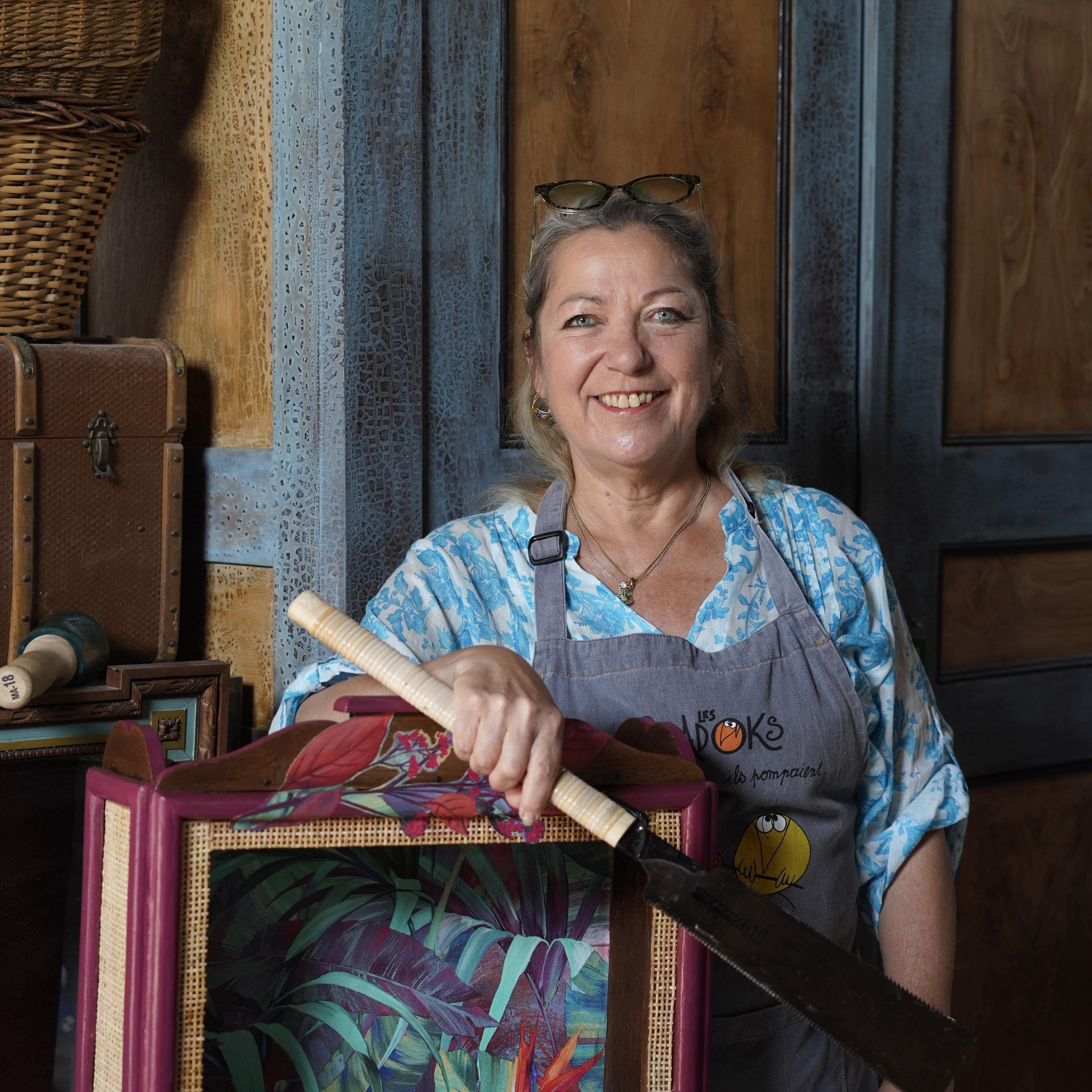
The Mapelcy Workshop
Mapelcy is a small french workshop and a new brand created by a woman with a love for wood and a special creative touch ✨
The Mapelcy concept
Gather old furnitures about to get thrown away and give them a brand new life.
Why was I needed ?
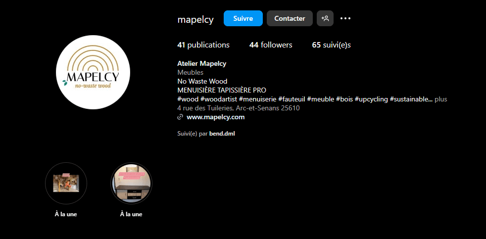
Mapelcy had been recently focusing on its social media presence (facebook and instagram) and its online portfolio. The only thing missing to create a profesionnal brand was a great logo !
What was requested ?
The client was very open to suggestions, but gave me a few tips about which ideas she felt the brand (and logo) should convey :
Elegance
Trust
Craftmanship
This logo should be distinguished yet modern, and have a strong connexion with wood or nature.
It should also contain the brand name (Mapelcy) and motto (no-waste wood).
By now, I had a pretty good idea of the emotions I was aiming at with the Mapelcy logo ⭐
My insight about colors
Black text : to inspire elegance
Gold-brown : to evoke wood and craftsmanship
Green : to evoke nature and recycling
My insight about shapes
Circles / Half-circles : would represent the wood but also the shape of the rotary saw
Leaves : would represent nature
(potentially) Arrows : would represent recycling or upcycling
First sketch and iterations
The initial sketch and first concept were based on the elements presented above : lines in a circle representing the wood and rotary saw used in woodworking, leaves representing nature, the basic colors and a first idea of composition.
Why did it not work ?
With all the versions that were designed, a main challenge occured : it was all too complicated. It was getting impossible to evoke simplicity and elegance when so many ideas were colliding in such a small image.
More specifically ;
Too many concepts in one
Too many sub-elements representing each idea (too many circles, too many leaves etc.)
The black square behind the text was hard on the eyes
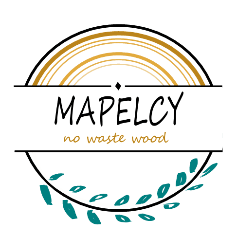
How did I solve this ?
My solution
Focus on 1 or 2 concepts (reduce the number of main ideas)
Illustrate each concept with simple shapes
Work on overall balance and colors
Let's see the final result !
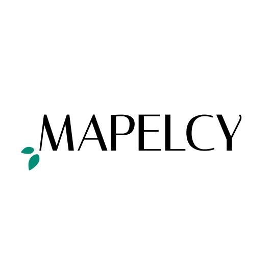
Digital Uses
The digital version is now used for :
Facebook
Instagram
The Mapelcy online portfolio
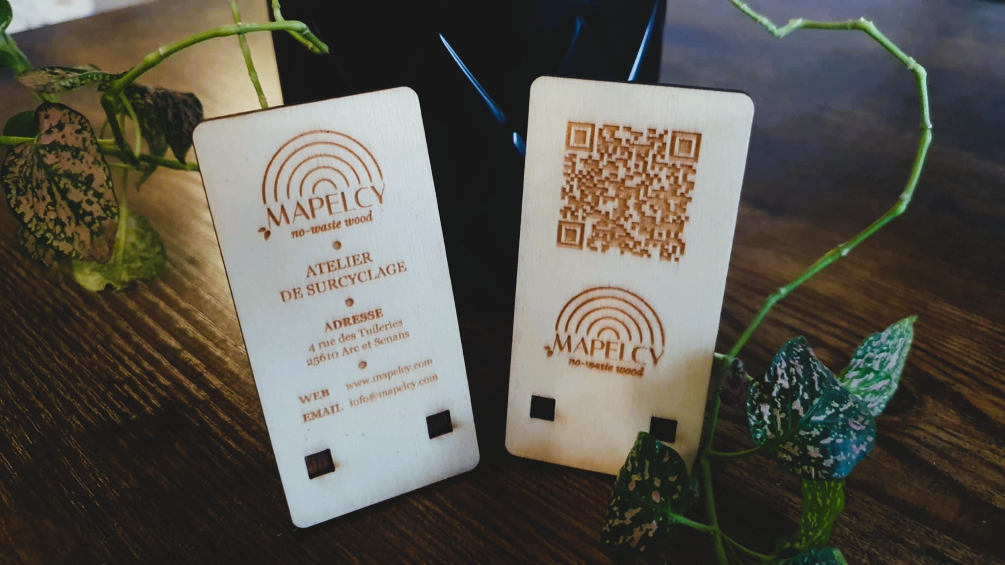
Physical Uses
The printed version is used for :
Business Cards
Official documents such as invoices
Wooden engraved supports
Customer trust
Mapelcy clients have been expressive great positive feedback about the new logo, which helped bring the brand to a new level of professional relationship.
This project was definitely challenging but finding the right balance between client expressed needs and my own insight was crucial, as well as learning to iterate while focusing on simplification. A few examples of personal and professional growth :
Developing insight
I had to distinguish what my client wanted, and what she actually needed. Therefore I worked hard to bring my own insight and ideas to a new level in order to convince her that this was the best path forward.
Mastering new tools
This was my first official design project using the Inkscape tool, which meant that I learned how to use it as I progressed with the logo creation, and master it fast enough to produce professional result as fast as possible.
The power of simplicity
However, the main point to note here is probably this one : I learned the power of simplicity and the process of trimming ideas and concepts to focus on the most important ones.
This was. as it happens, the key to this design's success.